Breathing new life into a classic establishment
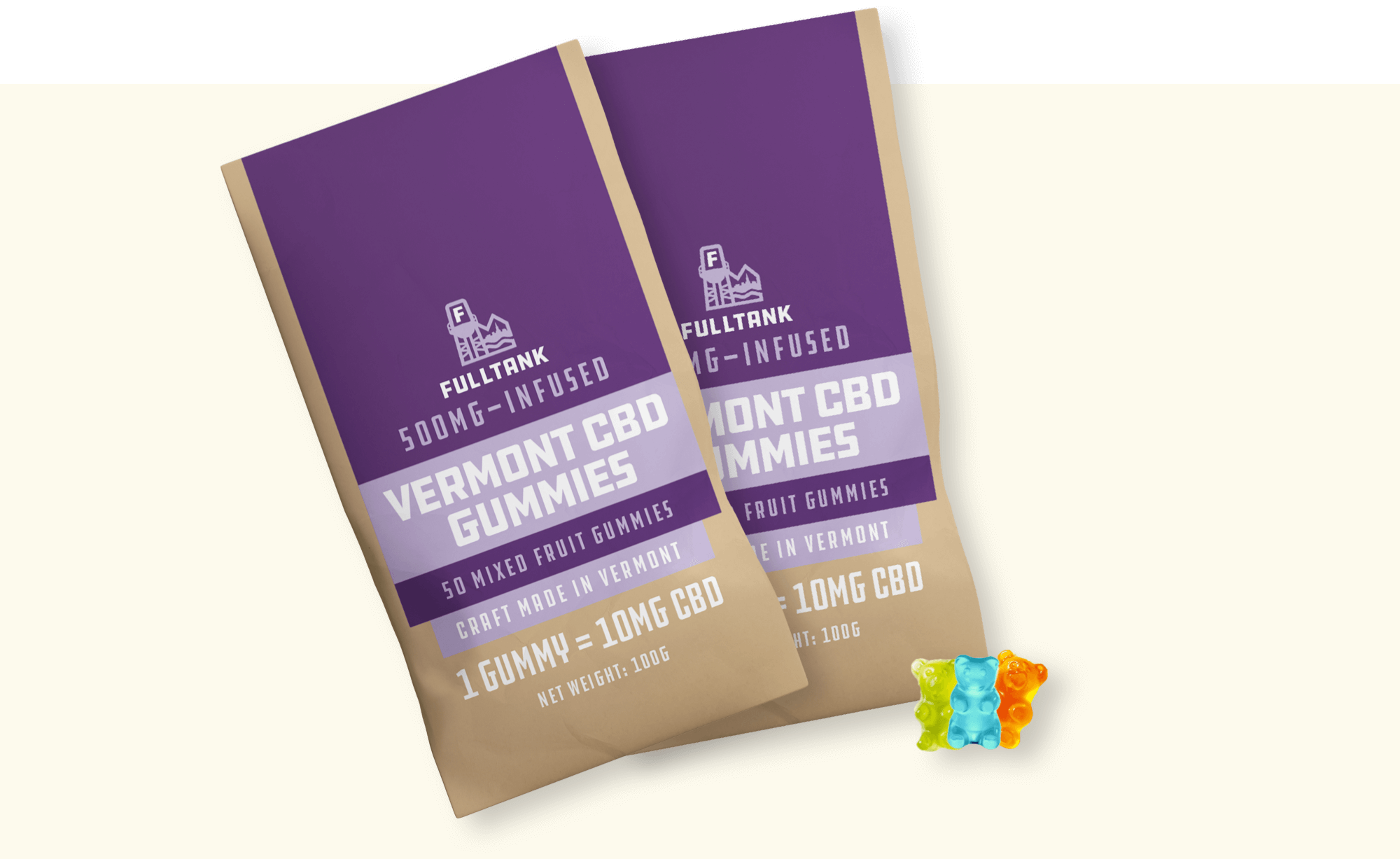
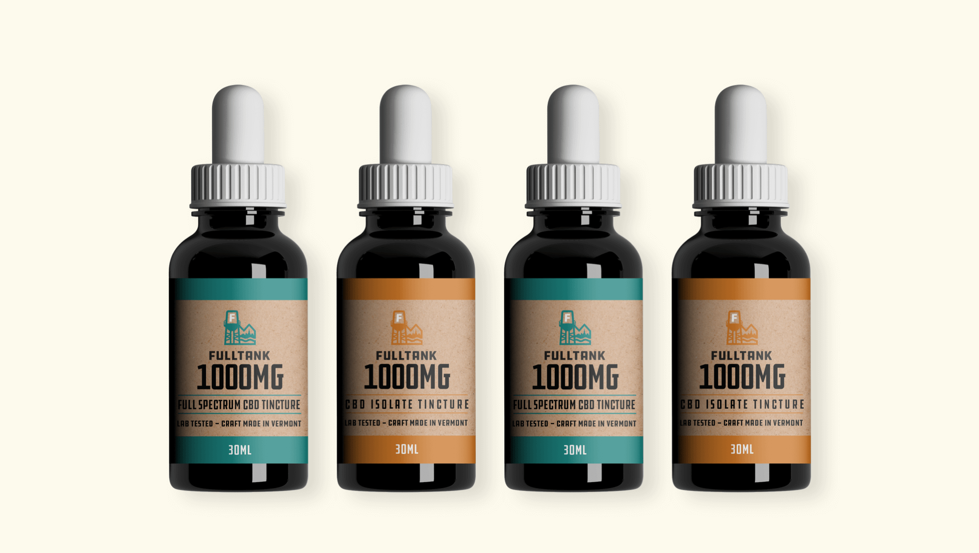
Full Tank is a head shop based in Burlington, VT with a ton of history. With their 20th anniversary just barely in their rearview, it was time to take a beat and reflect on who they had become and update their look. The other big variable, was the release of their CBD product line, which needed to compete with the sea of amazing Vermont hemp brands, stand out on its own while still maintaining the vibe that is Full Tank.
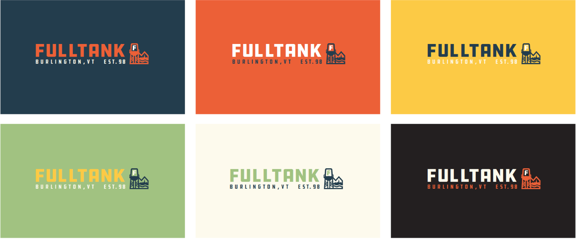
We went a bit literal, focusing on an iconic water tank visible in the downtown Burlington skyline, the equally visible mountain range that hugs Lake Champlain, and utilizing the dankest type-set to ever see the light of day. We were very excited to use Full Tank as our means to implement the Draplin Font Set, which is super strong, flat and industrial.