The evolution of a logo
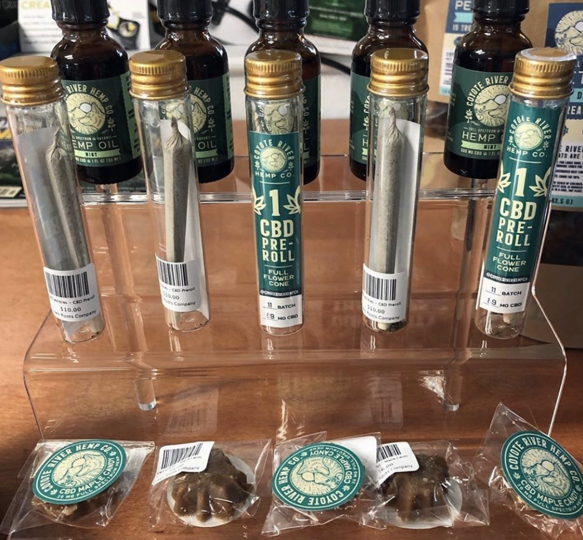
Often times we are charged with evolving an existing brand; taking a logo with some history behind it and turning it into something new. Coyote River Hemp Co, is one of the only companies bringing game from the New Hampshire area, providing a wide array of unique CBD products. They came to us about a year into their business, and decided it was time to give their coyote some love. The original logo is below.

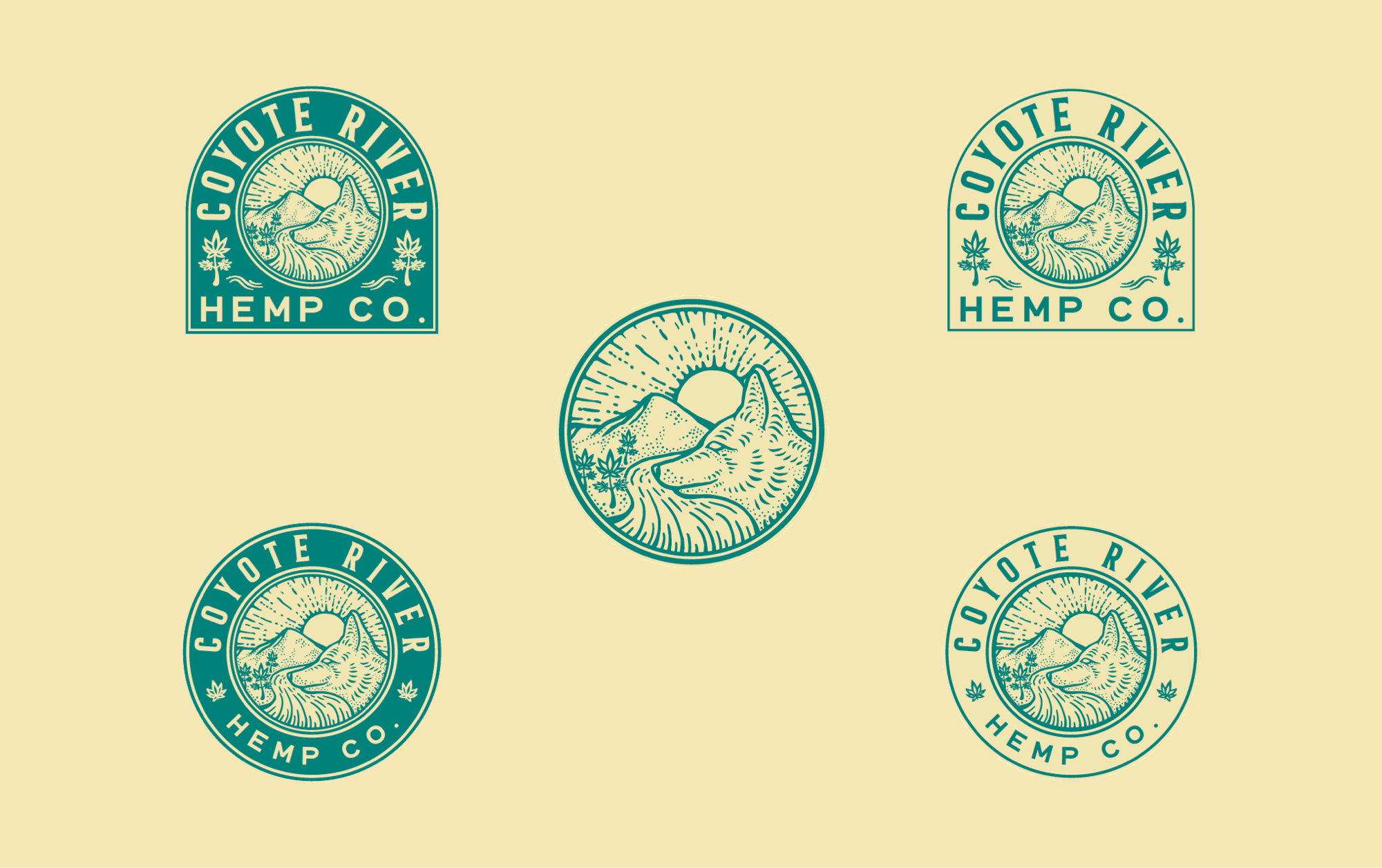
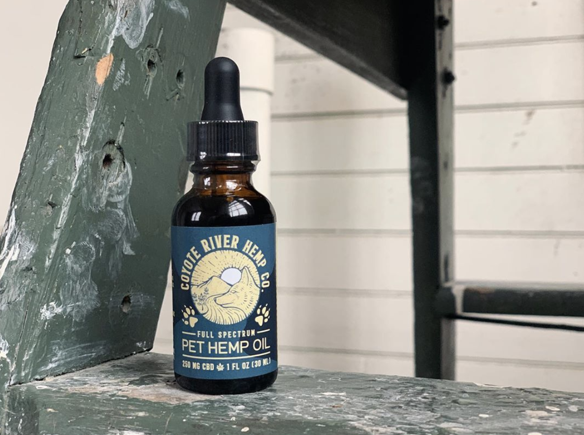
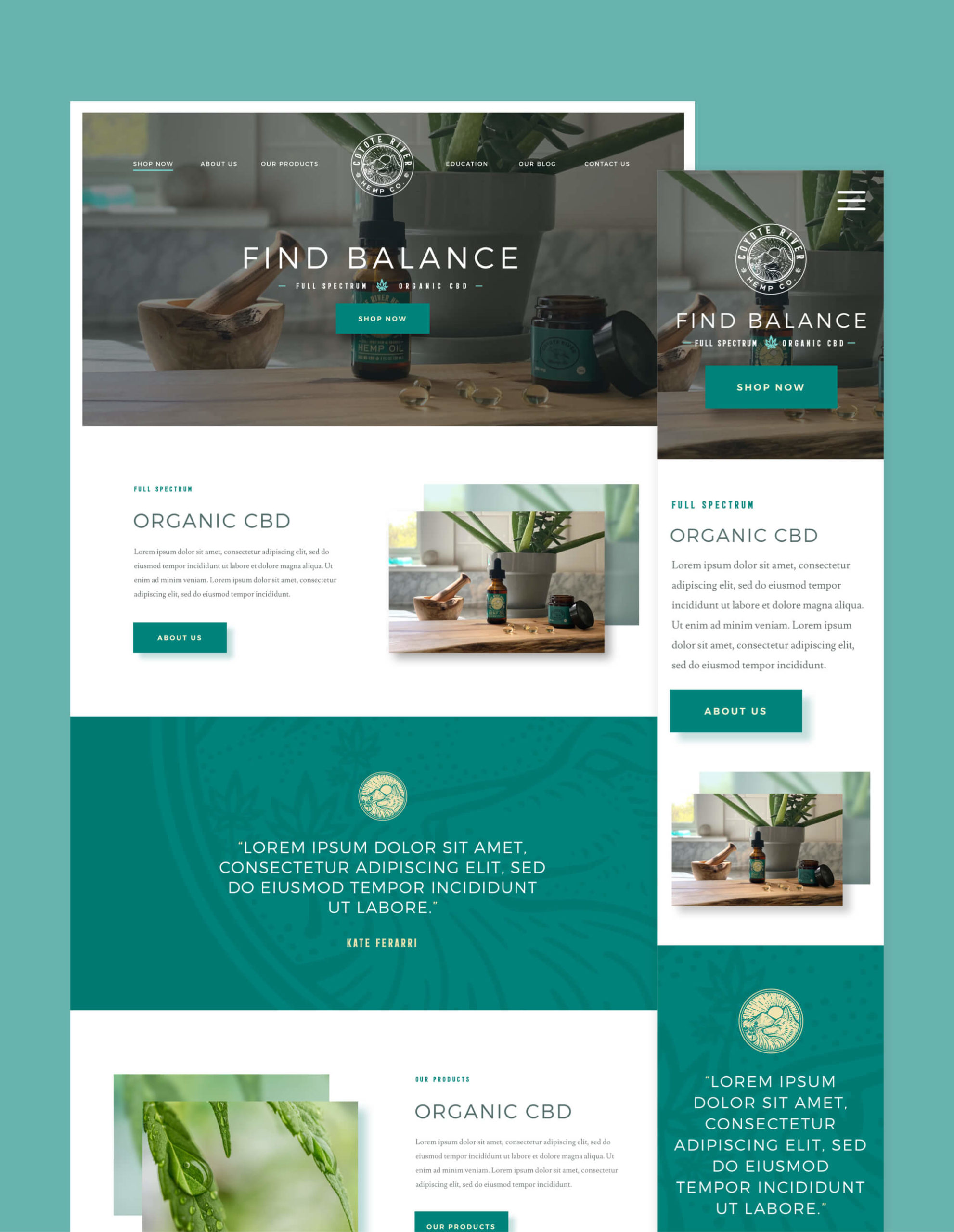
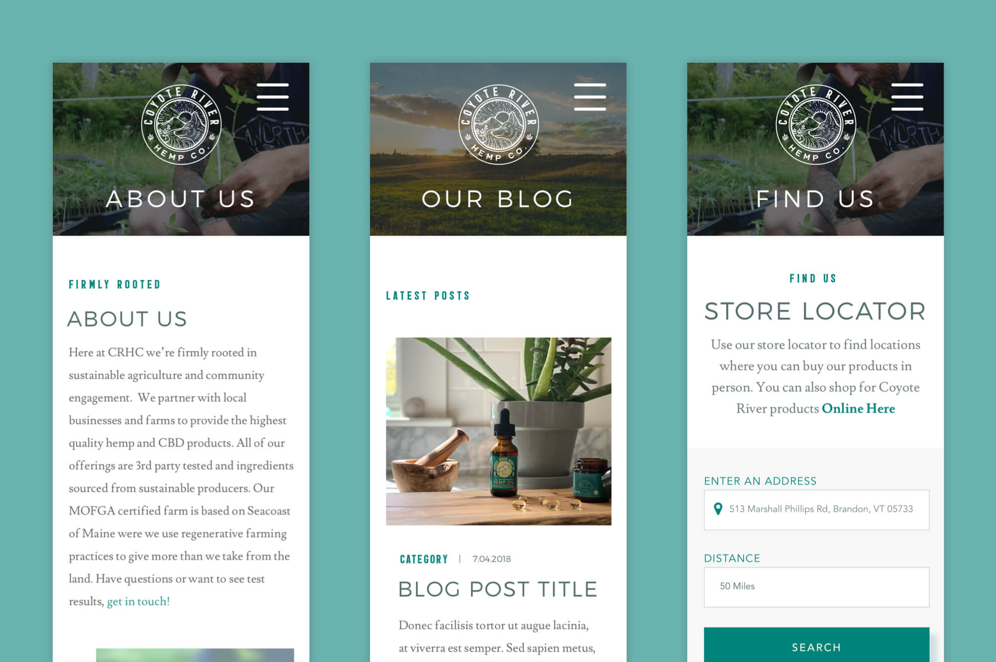
We pulled out some elements we thought would better suit a more memorable brand, and threw the fonts out the window – moving, instead, towards a flatter more bold font choice. We also included a bit more detail on aspects of the river, and the hemp leaves. You can see our evolution below.
